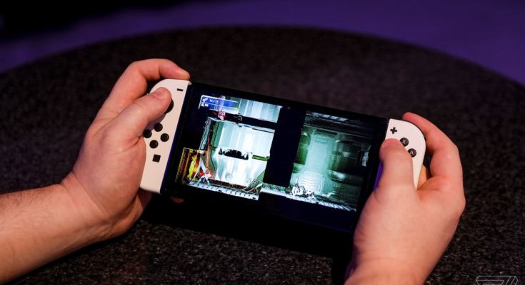
The new Nintendo Switch OLED Model doesn’t have a Pentile screen.
That might not mean much to you, and it wasn’t something we were able to confirm definitively during our review process — other than to say that the screen is a huge improvement. Which it is. But there’s been speculation ever since the OLED Switch was announced that its panel might use Pentile technology, which could have had big implications for image quality. Nintendo devices don’t tend to have the best screens, after all.
Pentile is a trademark owned by Samsung that refers to various subpixel matrix layouts most commonly used in OLED display panels. In casual conversation, or as casual as conversations about OLED subpixel layouts can really be, Pentile is now essentially shorthand for “not full RGB,” meaning that red, green, and blue subpixels are shared between pixels rather than each pixel having all three colors itself.
Almost all OLED screens in portable consumer devices use some form of Pentile subpixel layout these days. The benefit of Pentile displays is that they’re cheaper to produce and can last longer. The downside is that they’re functionally lower resolution than an equivalent screen with an RGB stripe, which means you can sometimes see artifacts like dithering and graininess, particularly in high-contrast situations like reading text.
The effect lessens as pixel density increases. Personally, Pentile stopped bothering me on phones when 1080p OLED displays became commonplace, which is to say that I didn’t like the Galaxy S III’s panel but was fine with the Galaxy S4. A 7-inch 720p Pentile screen on a Switch, then, would probably have been an problem. And Nintendo is not known for securing the best screen technologies for its devices — witness the 3DS, where some models randomly came with much better IPS screens than the regular TN LCD panels, with no indication as to which you’d get until you opened the box — so there was reasonable cause for concern over the Switch OLED Model.
Well, turns out there’s no need to worry. My personal OLED Switch preorder just arrived, so of course the first thing I did with it was take a macro photo. Here’s what the screen looks like up close:
:no_upscale()/cdn.vox-cdn.com/uploads/chorus_asset/file/22909635/IMG20211008145132_2.jpg)
This is a white area of the screen, so all the subpixels are lit up. The layout is actually a little unusual, with columns of blue subpixels next to smaller, alternating red and green ones rather than arranging them in uniform RGB lines. The Apple Watch does something similar, and I’m not sure what the advantages of this layout are — it presumably relates to the relative efficiency of each color. But what matters is that as you can see, each and every individual pixel is made up of a single red, green, and blue subpixel, or in other words you’re looking at a full RGB display with the same resolution for all three colors.
For comparison, here’s the iPhone 13 Pro:
:no_upscale()/cdn.vox-cdn.com/uploads/chorus_asset/file/22909650/IMG20211008152015.jpg)
You can see how the subpixels are arranged in a complex diamond layout, alternating blue and green on one line and red and green on the next. On displays like this, each pixel is comprised of fewer subpixels compared to LCDs and RGB OLEDs that reserve three specific subpixels for each pixel in the screen — the “green resolution” is actually higher than the other two colors. As I said before, it’s not really an issue on devices with such sharp panels, but the image quality can break down when pixels are visible to the naked eye.
It’s not necessarily a big surprise that the new Switch went with RGB — the original PS Vita had an RGB-stripe OLED display ten years ago — but you never know with Nintendo. There just aren’t that many 720p OLED displays of this size these days, or RGB OLED displays in general, so it was certainly an open question.
Anyway, glad to clear that up. Now I’m off to play Metroid Dread.


