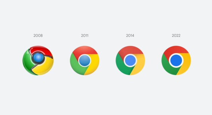
If you recently downloaded the latest Canary release of Google Chrome, you may have noticed the icon is different. The change marks the first time in eight years that Google has redesigned the symbol representing its iconic web browser. At first glance, it doesn’t look that different, but there’s more to the refresh than meets the eye. In a Twitter thread spotted by The Verge, Google designer Elvin Hu details the thought process that went into the redesign.
Some of you might have noticed a new icon in Chrome’s Canary update today. Yes! we’re refreshing Chrome’s brand icons for the first time in 8 years. The new icons will start to appear across your devices soon. pic.twitter.com/aaaRRzFLI1
— Elvin 🌈 (@elvin_not_11) February 4, 2022
If you look carefully, you’ll notice Google removed the shadows that were part of the icon, opting for a more flat design that’s in line with the company’s other products. It also changed the proportions of the symbol while brightening up the individual colors that make it up. But the most impactful change the company introduced is that it added subtle gradients to the green and red segments of the icon. Hu says the company found that certain shades of those two colors produced an “unpleasant color vibration” when placed next to one another. You can see a more apparent example of the phenomenon Hu talks about on this website. Either way, the result of the change is an icon that is “more accessible.”
Depending on where you use Chrome, you’ll see additional subtle changes. That’s because Hu says Google spent time customizing the icon to make it more at home in every operating system where you can download Chrome. On macOS, for instance, the symbol will look more three-dimensional. On iOS, meanwhile, there will be a special blueprint version of the icon tied to the beta release of the software. According to Hu, we’ll see the refreshed icon roll out over the next few months.
All products recommended by Engadget are selected by our editorial team, independent of our parent company. Some of our stories include affiliate links. If you buy something through one of these links, we may earn an affiliate commission.


