Google / Ron Amadeo
Android Auto, Google’s car interface app for Android, is getting a new, more flexible design at Google I/O. Android Auto previously demanded a pretty rigid screen aspect ratio. It could not handle things like large, vertically oriented car screens and would often resort to pillar boxing or letterboxing the UI to keep a reasonable layout. Now, Google says the interface is “built to adapt to any screen size” thanks to a new panel design.
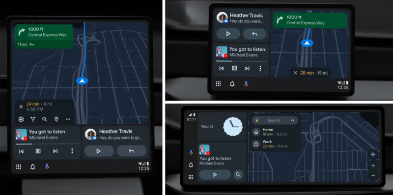
Google says that “there are three main functionalities that drivers prioritize in their cars: navigation, media and communication,” and the new Android Auto design puts each of those interfaces in its own panel. Maps gets the biggest, main panel, media and communication panels get stacked next to each other, and there’s a combo status/navigation bar. To accommodate the million different screen sizes, these items can be arranged in whatever orientation works best in the car.
One example, close to the current Android Auto configuration, shows the combo bar oriented vertically against the side of the screen, followed by a vertical stack of the message and media panels, then a big Google Maps panel. Another example of a more vertical screen design shows a big Google Maps panel on top of the message and media panels, with the combo bar on the bottom, where things can be arranged to fit.
The new interface will be out “this summer.”


