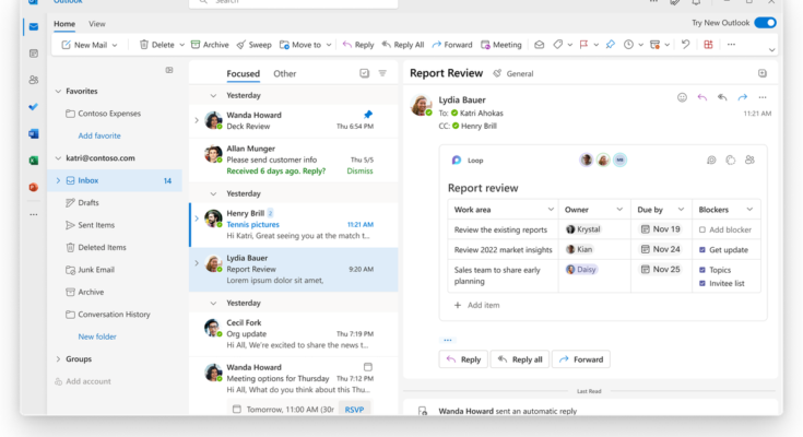
Microsoft has announced the beta for the new Outlook for Windows, which will make the desktop email client a lot more like the web version. While screenshots and an entire build of the app were recently leaked, Microsoft’s announcement gives us a good look at what kind of features we can expect to see coming to our inboxes.
According to Microsoft’s Tuesday post, Outlook will be getting quite a few new features in addition to an updated design. For starters, it’ll integrate with Loop, Microsoft’s system for collaborating on things like polls, task lists, and more throughout Office. There’s also a new system for attaching files. If you’ve got something stored in the cloud, you can type the “@” symbol and then the filename, and you’ll get a list of matching files ready to add to an email.
:no_upscale()/cdn.vox-cdn.com/uploads/chorus_asset/file/23545066/At_docs_search.png)
Microsoft’s also added a few calendar and to-do features. Some of them are simple, like the ability to pin emails to the top of your inbox so they’ll stay in your face until you deal with them. You’ll be able to drag emails over to a panel and set them as to-do items or as calendar events if you want to book time to respond — and after you’ve done that, you can look at the new calendar view that shows your task lists, notes, and various other customizable pieces of information alongside an actual calendar.
:no_upscale()/cdn.vox-cdn.com/uploads/chorus_asset/file/23545104/To_Do_drag_and_drop.png)
:no_upscale()/cdn.vox-cdn.com/uploads/chorus_asset/file/23545097/Calendar__Board_view.png)
I don’t want to make it seem like Microsoft’s reinventing email here. The app is still decidedly Outlook, even if it seems like it’ll just be a very fancy web view. But a few of these features remind me of what got me so excited about the now-defunct Mailbox app that Dropbox bought way back in the day. I’m also happy to see a revamp of the calendar interface; I’ve always hated the one that’s in the current desktop version of Outlook.
Microsoft’s post mentions myriad other features, too. For example, when responding to a calendar invite, you can specify whether you’ll be attending in person or virtually; the inbox-cleaning Sweep feature will be included in the app; and Outlook will pin messages that it thinks are important if you seem to have missed them. You can see the full list of features, along with screenshots and descriptions, on Microsoft’s page.
As always with apps based on web technology, I do have a little bit of trepidation around this future update, especially its performance. I also assume that longtime Outlook users will have to endure one heck of an adjustment period, especially if it’s the main app they spend their days in. But, at the same time, I very much like the idea of Outlook having the same functionality on the web and in the desktop app, rather than making us use two substantially different UIs. Plus, the features that Microsoft’s showing off mesh very well with how I view email. So, color me cautiously optimistic.
If you feel the same, you may be able to try it out yourself — though you will need a commercial or educational Microsoft account. If you’ve checked that box, you can sign up to be an Office Insider and join the Beta Channel. Once you’ve done that and updated to the latest version of Outlook, there should be a toggle letting you switch to the new version. Of course, do keep in mind that it is a beta; be sure you’re comfortable with running your email through a program that’s still in the works.


