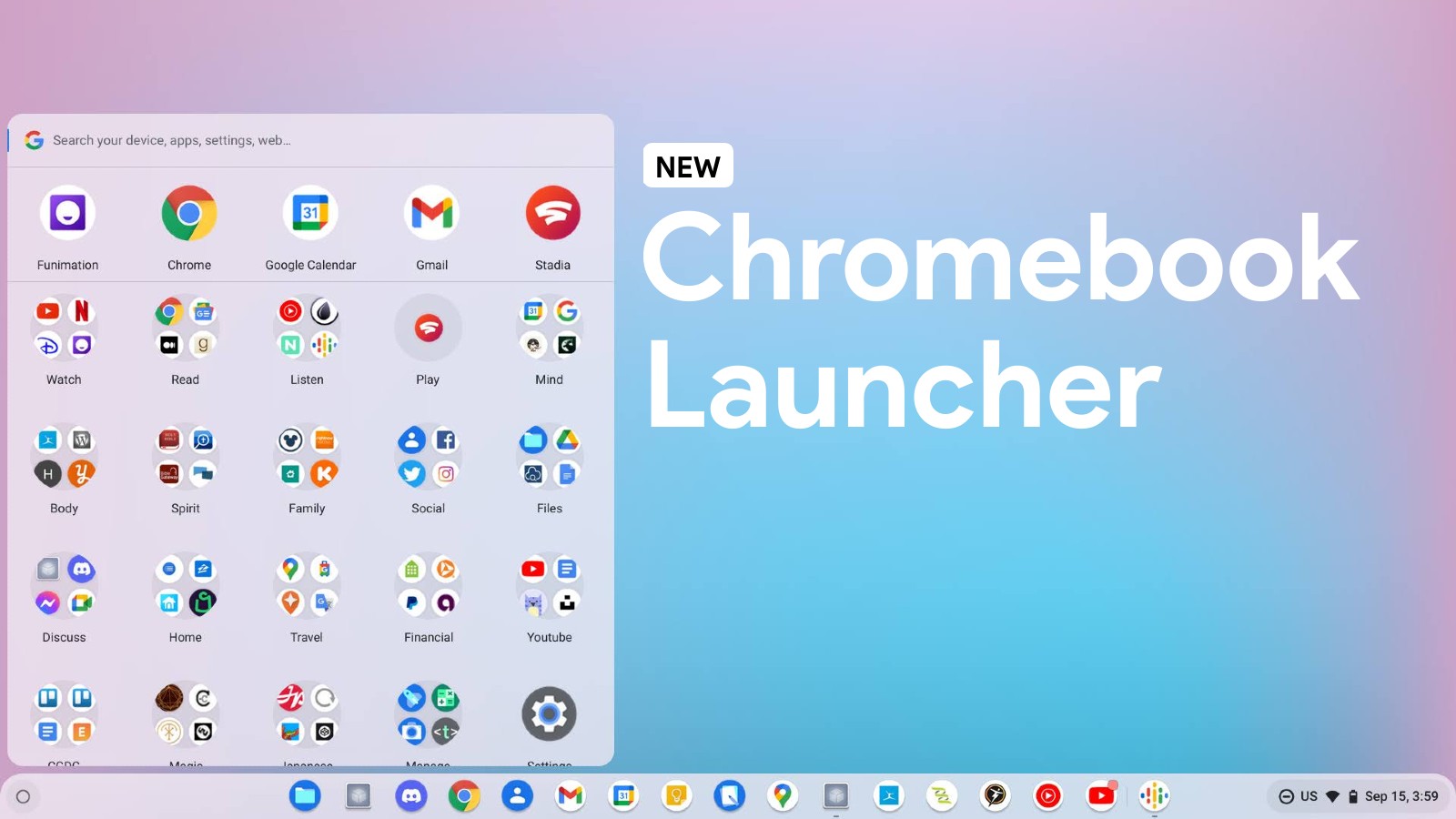
I can’t tell you the last time that I used my Chromebook’s app launcher to well, launch an app. I mean, that’s not entirely true. I do use it to search for an app via typing and then tapping the result to open standalone PWAs, but what I really mean is that I have no clue when I last scrolled through the list of apps in order to select one manually, and I have several reasons for that.
First and foremost, I’ve lived much of my ChromeOS life in Canary mode, so I’ve trained myself not to rely on something that’s always going through changes or that is consistently busted, and the launcher has qualified as all of these things quite often over the past few years.
Second, and probably more importantly, the synchronization of apps in the launcher has been laughably unreliable for longer than I can recall. I’ve written about this quite a bit in the past, especially when I gave my wishlist of vital changes it needed to apply in order to be worth using. While I’m happy to report that many things from that list have already been taken and implemented as feedback thanks to the development team, the damage has already been done. In true Google fashion, the launcher itself has been so unreliable for so long that I’ve trained myself to avoid it at all costs for visual selection.
Don’t get me wrong, I think the launcher is a vital piece to Google’s operating system and allows it to stand out among the crowd. It’s a unique feature and lets users store and recall a seemingly infinite number of website icons (web apps) in a standalone fashion as opposed to constantly typing in URLs or visiting websites via Chrome tabs in the main browser with other things, so it feels very personal and the experiences feel more contained. I also love the idea of collecting and organizing app icons so that my Chromebook truly feels like it’s mine instead of just being a device I logged into at the library and clicked the Chrome browser to begin Google searching. App icons give that ‘Windows program list’ feel if you know what I mean.
However, every time I move an icon into another folder, or in another location in the launcher, or even any time I delete a handful of old PWAs from the list, they immediately reappear after I reboot my Chromebook. I thought that this would be resolved when the company finally released its Productivity Launcher, but I think I was mistaken in thinking that the performance and experience problems would be resolved when it finally came to reassessing the entire thing at its core – an opportunity Google recently had when it built this from the ground up!
The productivity launcher is more functional and beautiful than its predecessor, the Peaking Launcher, but if it’s just as flaky at performing the core functionality it was built for, then I think I’ll continue to search for what I’ve got in there and launch it blind. Again, search is faster and has even become second nature in my use of Chromebooks, but that doesn’t excuse the fact that I’m constantly haunted by icons that keep resurrecting themselves from the dead and cluttering the top of my launcher.
My fear is that Google will do what Google always does and focus more on the visual aspect of beautifying things and entirely neglect fixing what everyone has hated about them from the start. It’s famous for launching things half cooked and then implementing user feedback to make the experience passable over the course of 5-10 years thereafter, but when it comes to the bread and butter of the Chromebook, I hope that stops being the trend.
For now, the only time I ever have use for my Chromebook launcher from a visual ‘pick-an-app-icon-and-touch-it’ standpoint as opposed to rapidly searching and smacking the enter key on my keyboard is when I’m using my Lenovo Chromebook Duet in tablet mode. That’s because it makes a whole lot of sense to have icons for a touch experience. For this reason, I don’t think that Google should get rid of the launcher entirely, but I do believe it has a responsibility to its users to fix this sync issue. If it doesn’t, and I don’t truly believe it will seeing as to how it’s already been a prominent annoyance for years, then I’ll continue to ignore it, and that’s just unfortunate.


