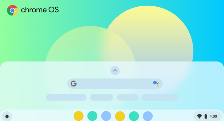
It’s no secret that your Chromebook’s app launcher could use a serious user experience overhaul. As it is today, Chrome OS is devoid of any method of sorting your apps, meaning all rearrangement of your apps has to be done by hand, and it creates new pages in the launcher seemingly at random. The end result is an unusable mess, making it frustrating to find your important apps unless you use the search bar. After years of neglecting user feedback, it seems Google is finally doing something about it.
We’ve been monitoring Google’s efforts to improve the app drawer experience on your Chromebook, including a completely redesigned launcher that’s much more mouse-friendly. While it’s a welcome change, it didn’t fix the launcher’s lackluster app sorting issue that made it infuriating to use. That could all change, thanks to a work-in-progress commit first spotted by 9to5Google over at the Chromium repository, which will add a new Chrome flag to switch on app sorting.
App sorting in the launcher is finally in the works.
Information about how Google will implement app sorting is sparse, so we don’t know any specifics on how it’ll work once it’s implemented. We think (or maybe just hope) that it’ll allow people to sort their apps alphabetically, similar to the launcher found on Pixels, but it could also sort apps by their category. It’ll be available in a subsequent Chrome OS canary update, which we can’t wait to try out.
Personally, I can’t believe Google waiting this long to implement app sorting. The broken launcher experience has been a problem for years, and despite heaps of feedback asking to include a sane method of sorting apps (including a great article written by ChromeUnboxed), Google simply ignored it. I’m happy Google is finally doing something, but this should’ve honestly come way sooner.
And that’s where the underlying problem is: there are still serious bugs and kinks in Chrome OS that have been around for years despite constant reports sent out by users. Issues like janky multitasking in tablet mode and lack of system UI polish (where’s the simple calendar widget, Google?) really detract from the user experience, which Google seems to have no interest in fixing. The stagnated development is not a good look for new users who plan on using Chrome OS long-term.
Time will tell when Google will add app sorting to Chrome OS. If done competently, it could finally put a serious usability issue to rest — I just hope it’ll come soon rather than later.


