Google is steadily bringing more and more productivity tools to Chrome OS. While projects such as the Linux container on Chromebooks have expanded the capability of the OS exponentially, it’s the constant subtle add-ons that continue to make Chrome OS more user-friendly and conducive to a more efficient day-to-day workflow. Virtual Desks and Phone Hub are two very good examples but one particular feature is a powerful productivity tool that lives right on your Chrome OS shelf and I’d wager that many are missing out on all its tasty usefulness. I’m talking about the Holding Space, a.k.a. Tote.
Tote
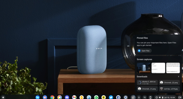
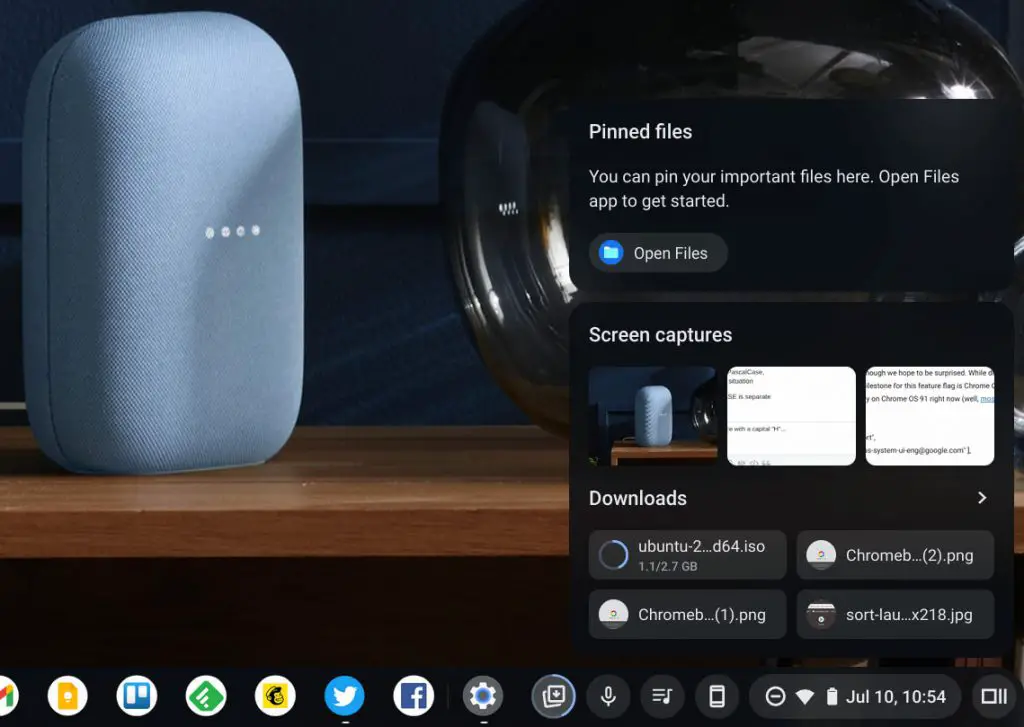
In case you’ve overlooked it, Tote is a holding space for recently saved files. It lives just to the left of your system tray where you find the time, battery level, and other settings. When you save a file, the most recent ones will appear in that holding space for you to quickly and easily retrieve with just a click of your mouse. If the saved file is an image, the handy preview shows you a small, circular crop of the image and a recent update to Tote allows you to hide those previews should you need to do that. Downloads and screen captures are separated into their own space and especially important files can be pinned to the top of the Tote so that they do not get lost in the shuffle as you download more files.
This tool is extremely helpful for users that are doing a lot of graphic design, creating presentations, managing documents, or countless other use cases that I’m sure can benefit from Tote. As Android Police’s Kent Duke points out, Tote has been a game-changer for him as a college student who is constantly downloading lecture notes and assignments. The files are then right at his fingertips and there’s no need to go digging through the Files app to access them. From a productivity and workflow standpoint, there are few additions to Chrome OS that have as much potential impact as the Tote – if you’re actually using it, that is.
The latest update to the Chrome OS Tote will make monitoring your downloads even easier with a much cleaner UI than the current method. As you are likely aware, downloading a file to your Chromebook currently results in a rather intrusive system notification that launches from the system tray. For smaller files like images and such, the notification usually disappears almost as quickly as it arrives as soon as the download is complete. For larger files, you have to dismiss the notification to get it out of your way and then you get another popup when the download completes. A new flag in the Canary channel brings a progress bar to the Tote holding space that visualized the download in a much cleaner fashion.
chrome:flags#enable-holding-space-in-progress-downloads-integration
Show in-progress download functionality in Tote to increase productivity by giving users one place to go to monitor and access their downloads. – Chrome OS
Chrome Canary
When enabled, downloading a file still triggers the system tray notification but now the file appears in the Tote with a little blue progress ring around it to show you how things are going. The overall look feels way more Google-y than the current UI and I personally hope that it becomes the default with the large system notification going away. The downloads progress bar feels very polished and is working exactly as you would expect it to but there is probably still some tweaking to be done. Kent Duke points out that, if your downloaded file has a similar color scheme to the progress bar, it makes it a bit difficult to see. He mocked up some really good images of how this could be overcome and I sincerely hope that Google runs with his idea if they haven’t already. You can find his full post and the awesome mock-ups over at Android Police. We’ll keep an eye on this new feature and let you know when it starts moving up the Chrome OS channels.


