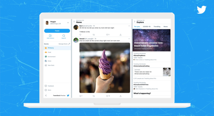
TweetDeck is a secret weapon for Twitter power users. The column layout allows them to keep tabs on tweets from a large number of accounts at once, using Twitter’s handy lists. That could be about to change, based on an image Twitter shared of the “new and improved TweetDeck” that it’s testing. At first glance, it looks a lot like the standard Twitter web app.
The company is testing the revamped TweetDeck with a few users in the US, Canada and Australia. Twitter product head Kayvon Beykpour said the updated TweetDeck includes “a full tweet composer, new advanced search features, new column types, and a new way to group columns into clean workspaces.” A menu on the left lists a number of “decks” centered around things like food, entertainment and news, as well as a “primary” deck.
Any big changes to TweetDeck will surely be met with skepticism from heavy users. Many of those who use the app do so as part of their jobs, and significant updates that disrupt people’s workflow might not sit too well with them.
Still, it’s worth remembering that this is a test and things might change before the updated TweetDeck rolls out more broadly. “Through these tests, we’re exploring how we can give people more customization and control using TweetDeck,” Beykpour wrote in a tweet.
Rumors have been floating around for a while that TweetDeck might become part of Twitter Blue, the company’s subscription service. Beykpour added a little fuel to that fire when discussing the app’s overhaul. “We’ll take these lessons into account as we explore what TweetDeck could look like within Twitter’s subscription offerings later on. We’ll have more to share soon as we learn from these tests,” he wrote.
All products recommended by Engadget are selected by our editorial team, independent of our parent company. Some of our stories include affiliate links. If you buy something through one of these links, we may earn an affiliate commission.


