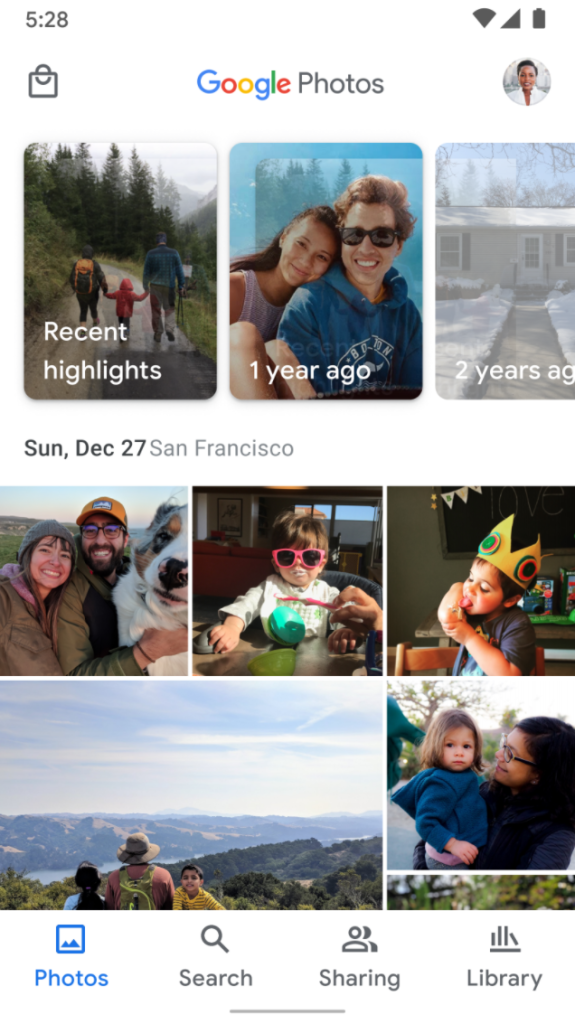
Last June, Google redesigned the Photos app with cleaner navigation, new logo, and a map view. In response to “user feedback and comments,” Google Photos is reverting one change to bring the “Sharing” tab back to the bottom bar.
With the revamp last year, “Sharing” was placed in the top-left corner on mobile, thus allowing Google Photos to just have three core sections. It’s now back in the bottom bar, though as the third item from the left — rather than the fourth. To preserve muscle memory, Library fortunately remains the last tab. Google says it’s “bringing your shared photos back to the home screen, allowing you to easily view and manage shared content.”
Meanwhile, the Print store — where available — is now taking that corner position and being moved out of the Library tab, where it’s currently a carousel advertising books, photo and canvas prints, and the premium print series. This tweak helps make the Library tab focused on just your albums, archives, and folders.
We are always looking for ways to improve the Google Photos experience by listening to user feedback and comments. Today, we are starting to roll-out UI changes to make it easier to find your shared memories and the print store.
These changes are rolling out today on Android and coming soon to iOS.

More about Google Photos:
FTC: We use income earning auto affiliate links. More.


