This story was originally published 2021/06/11
6:50am PDTon Jun 11, 2021 and last updated 2021/07/15
6:19am PDTon Jul 15, 2021.
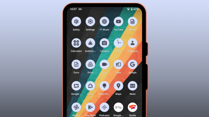
Android 12 Beta 2 first introduced monochrome icons for Google apps based on your wallpaper’s colors, much like other interface elements as part of Material You or Monet. Beta 3 expands on these capabilities. It’s the first release of Android 12 that introduces a user-facing toggle to turn on or off these themed icons in the Wallpaper & style app, and while it’s at it, it’s adding a ton more Google apps to the list of supported icons.
As reported by app developers kdrag0n and Kieron Quinn, there was a hidden flag in Beta 2 that allowed you to theme a few app icons on Android 12 Beta 2, matching the colors extracted from your wallpaper. The list was (and still is) exclusive to Google apps, safe for a few like Messages, Phone, and Photos — though these have become themeable in Beta 3, too.
Credits: Kieron Quinn (left), kdrag0n (middle & right).
In the examples above, you can see that the apps have gained accent-colored backgrounds and black iconography in light mode while they’re inverted in dark mode. This monochrome look is calm, beautiful, and understated design that’s almost the complete opposite of Google’s recent push for candy-colored app icons.
Soo, I did something again 🙂
The icon can be based on these colors. pic.twitter.com/mRYXWYMOek
— Dylan Roussel (@evowizz) May 20, 2021
According to evidence gathered by Quinn, it looks like the list of compatible apps is currently hard-coded into the Pixel Launcher. While support might initially be limited to Google apps only, it looks like the company is getting everything in place to expand support to third-party apps. Developer Dylan Roussel has already implemented theming support for a pre-release version of his device information app Inware.
Left: Almost all apps are supported. Middle: No theming in the app drawer. Right: Toggle in the wallpaper app.
As covered by XDA’s Mishaal Rahman, the Pixel Launcher expands the list of supported app icons in Beta 3, and it’s finally possible to turn themed icons on or off via a toggle in the wallpaper app. Only a few Google apps aren’t supported, like Stadia and the legacy Google Pay app (which is still the only version available in many parts of the world). For some reason, the themed icons don’t carry over to the app launcher, where you’ll find the regular app icons instead. It’s unclear if this is intentional or a bug.
Wayyyy more Google app icons support being themed now. H/T @Quinny898 for the code snippet and GooglePixels on Telegram for the screenshots of the themed icons. pic.twitter.com/FT2XbKPugD
— Mishaal Rahman (@MishaalRahman) July 14, 2021
We initially speculated that the company might want to use these themed icons in other places than the launcher, like in the notification shade or the Recents screen, but given that the wallpaper-based icons are now user-facing and active in the launcher, it’s almost safe to assume that this is where Google intends to use them. Let’s hope that third-party icons will follow suit sooner rather than later — I love the new icons, but I already dislike the inconsistent look they currently give my homescreen.
Love the icons, but don’t love the inconsistent look.
For more about Android 12, check out our ongoing series coverage here, or bookmark our regularly updated changelog and check back in later. If you want to install the developer preview on your own device, find out how in our Android 12 download guide.


