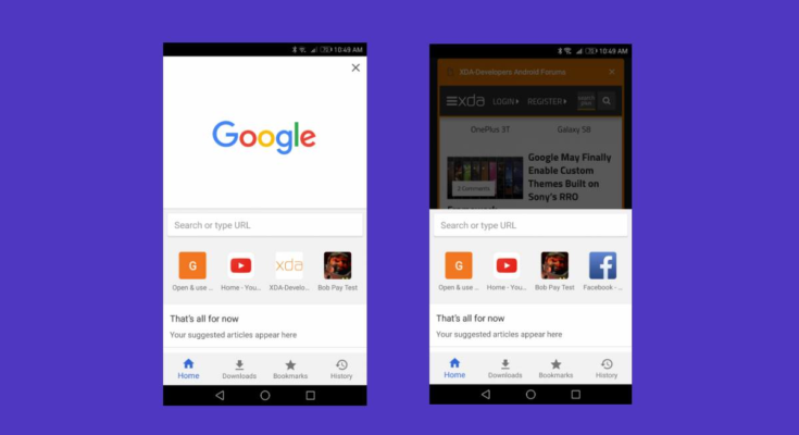
Google Chrome for Android has continued to evolve over the years with new features and improvements, but it hasn’t seen a major UI refresh in a long while. Google did experiment with new UIs on several occasions but plans never made it past the testing phase. The first attempt, dubbed Chrome Home, came in 2017, which saw the address bar being moved to the bottom of the screen. Google later deprecated it in favor of Chrome Duplex (later named Duet), which introduced a split toolbar and underwent several updates before being finally killed off a year later. While Google never publically disclosed why it abandoned these UI experiments after lengthy testing, an ex-Googler has shed more light on the matter.
In a blog post on his site, Chris Lee, a former Staff Interaction Designer at Google Chrome, described Google Home as “an ambitious redesign of mobile Chrome’s main UI.” Lee created the original idea and pitch for Google Chrome. The new UI brought Chrome’s Omnibox to the bottom along with the tab switcher and the three-dot menu and revealed Discover, Downloads, Bookmarks, and History tabs when you swiped up.
The project was meant to address two issues:
- To improve one-handed usage and reachability on phones with large screens.
- To make new features easier to discover — as everything was kept behind Chrome’s three-dot menu, which made features hard to discover for average users.
As Lee writes, “The idea caught traction internally, eventually becoming a Chrome org priority. I then led a team to execute and iterate on the concept.”
As live testing began, there was a mixed reaction. The new UI gained a cult following among power users. However, the change didn’t sit well with some mainstream users, prompting Lee to reconsider the whole thing.
“We heard a mixture of reactions. The feature gained a cult following among the tech community. But for some mainstream users, the change felt disorienting. Chrome serves billions of users around the globe with varying tech literacy. I became increasingly convinced that launching Chrome Home would not serve all our users well. So just as I strongly as I had pitched the original concept, I advocated for us to stop the launch – which took not a small amount of debate,” wrote Chris Lee in the blog post.
Interestingly, Lee adds that Apple’s new Safari redesign in iOS 15 shares many similarities (and criticisms) with the now-abandoned Google Home UI.


