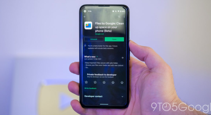
Google is launching its “Material You” design language later this year, but ahead of that, the Files by Google app has gotten a noticeable redesign with Material You elements.
Update: Files by Google now also respects Android 12’s Material You dynamic colors.
When Google unveiled Material You, its newest design language and successor to Material Theming, at I/O 2021, the company showed a preview of how app developers may use the framework in their own apps. So far, though, most of Google’s apps have not yet updated from their Material Theming design, with the exception of Chrome and Messages.
In the last few weeks, a redesign has begun rolling out to the beta version of the Files by Google app, particularly on Android 12 devices. While the app is functionally the same and laid out in much the same way, there are a significant number of tweaks that point toward this being a Material You redesign.
The most noticeable change is in the Files by Google bottom navigation bar. Previously, you’d know which tab was selected based on which tab was shaded blue. In the new design, a pill shape surrounds the icon of the selected tab. The bar itself is also now a shade of light blue versus the white it used to be.
Update 8/9: Files by Google has gotten yet another Beta update today, and with it, the app’s Material You redesign has replaced its numerous blue shades with Android 12’s dynamic colors. In the example below, the blue portions have changed hues to a lilac purple.
It remains to be seen whether Google intends for more in-depth changes to the Files by Google app’s design before Material You launches later this year.
Similarly, the upper bar — with the Files by Google logo and the search button — has been given a Material You-esque makeover, removing the shadow effect. Instead, to differentiate app’s visual layers, the upper bar now transitions from white to blue when you scroll down.
Another significant change on display is that Files by Google has switched fonts from the older Roboto to the newly launched Google Sans Text. With the redesign, Google has tweaked the app’s headings to use uppercase and lowercase letters, versus the old design, which exclusively used uppercase.
Of course, what really makes a particular app’s redesign an instance of Material You is changing the app’s colors to match your wallpaper. For now, Files by Google does not make use of the Material You colors, though this could change before Material You formally launches on Pixel phones later this year.
What do you think of the new design for the Files by Google app? Let us know down in the comments.
More on Material You:
FTC: We use income earning auto affiliate links. More.


