Robert Triggs / Android Authority
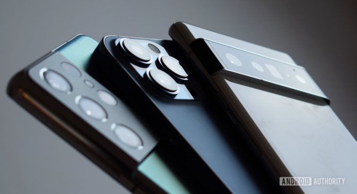
It’s hard to argue against the notion that smartphone designs have become significantly less diverse and radical over the years. After all, there are only so many ways you can package the same set of hardware — besides foldables like the Galaxy Z Fold 3, of course.
That said, there were still quite a few outstanding smartphone designs that caught our attention this year. We also came across a handful of design choices that left us a bit disappointed, but let’s talk about that later. For now, here’s what we think the best (and least exciting) smartphone designs of 2021 were. Don’t forget to vote for your favorite in the poll below!
The sexiest smartphone designs of 2021
Google Pixel 6 and 6 Pro
Robert Triggs / Android Authority
For years, the Pixel series did little to differentiate itself from the rest of the smartphone industry in terms of design. In fact, the last time we saw a unique-looking Google phone was in 2015 — before the Pixel brand even existed. Thankfully, all of that changed this year with the Pixel 6 lineup — Google’s first phone in years that doesn’t have to catch up with the rest of the industry.
Read more: Our Pixel 6 review
In October, a poll we conducted revealed that 90% of our readers liked the Pixel 6 series’ design. It’s not hard to see why — both Pixel 6 models feature a unique and stylish camera bar spanning the phone’s width. Overall, the design is reminiscent of the Nexus 6P. And if that wasn’t enough, you can also get the Pixel 6 in an assortment of fun and playful colors. The only complaint we’ve seen regarding the phone’s design is that the camera lip tends to collect lint in its bottom crease over time.
Oppo Find X3 Pro

Robert Triggs / Android Authority
Oppo’s Find X series has always managed to carve out a special niche for itself. Last year’s Find X2 Pro, for instance, was offered in two unique finishes — ceramic and vegan leather. This time around, Oppo dropped exotic materials in favor of a fairly typical glass back. However, it still impressed us with a highly unique camera bump design on the Find X3 Pro.
Read more: Our Oppo Find X3 Pro review
Instead of opting for a boring rectangular cut-out with sharp edges, Oppo went to the other extreme and accentuated the Find X3 Pro’s camera bump with a unique, gently sloping design. The back is constructed from a single piece of glass heated to a super high temperature and carefully forged to the desired shape. In a blog post, the company said it experimented with 100 different manufacturing molds before settling on the final design.
Samsung Galaxy S21 and S21 Plus
David Imel / Android Authority
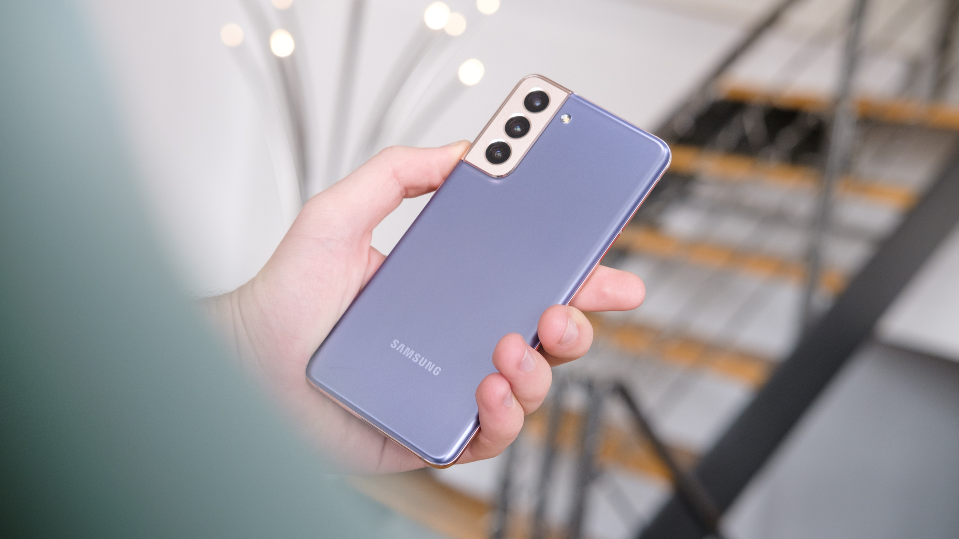
Even nearly a year later, the Samsung Galaxy S21 and S21 Plus are extremely fashionable devices — especially in the Phantom Violet color pictured above. The company knows it struck gold here as it features this colorway in most of its marketing and press materials. It’s easy to see why — when you combine the two-tone look with how the frame smoothly transitions into the camera bump, the S21 looks more futuristic than utilitarian.
Read more: Samsung Galaxy S21 review
Even though Samsung downgraded the base S21 to a plastic back instead of glass, the soft-touch finish retained the premium feel we’ve come to expect from flagship phones. At just 171g, it’s one of the lighter devices on this list. We don’t officially know what the upcoming Galaxy S22 series will look like, but it’s safe to say that the company has set a rather high bar for itself.
Realme GT
Dhruv Bhutani / Android Authority
Remember the Oppo Find X2 Pro’s vegan leather back? This year, Realme rebooted that idea with the Realme GT — a premium sub-flagship smartphone that slipped under most people’s radars.
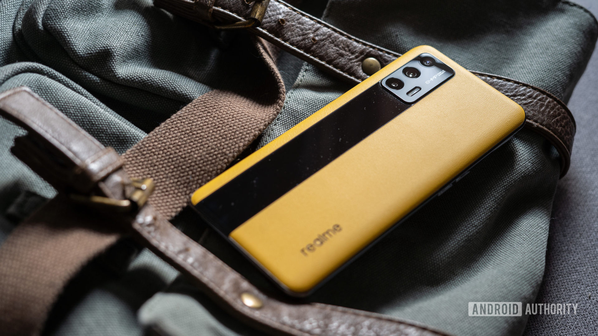
According to the company, the Realme GT’s Racing Yellow colorway was “inspired by the color of dawn” and meant to signify “the color of hope.” Thankfully, if you don’t see the resemblance, there’s an alternate interpretation, too — the black bar running the length of the phone looks a lot like a sports car racing stripe.
The faux leather finish offers functional benefits over glass and plastic too. In our review, we praised the phone’s exceptional grip and fingerprint resistance. Overall, the Realme GT ticks all the right design boxes, especially if you dislike cases.
Which 2021 smartphone design did you like the most?
883 votes
Smartphone designs that didn’t impress us in 2021
Honor 50
Robert Triggs / Android Authority
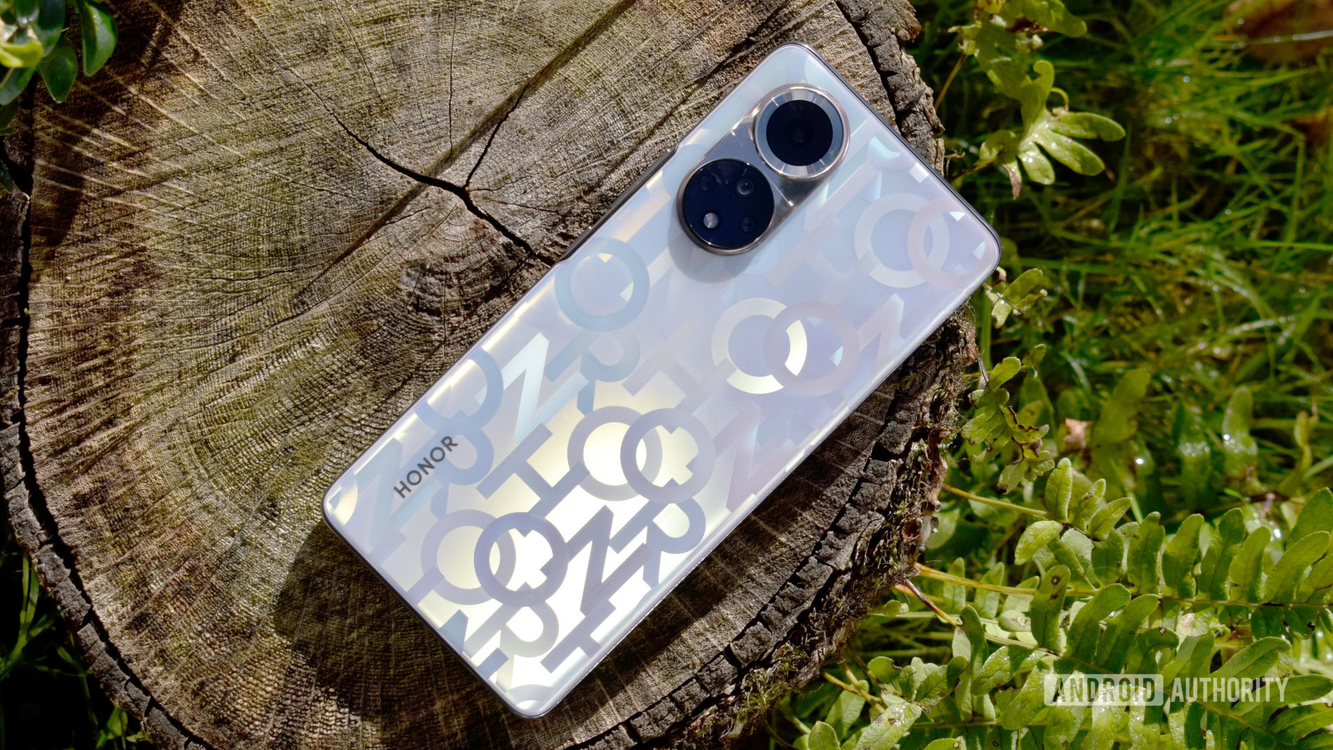
Are you fond of clean smartphone designs and nondescript branding? Well, the Honor 50’s special edition Honor Code colorway is definitely not for you. It’s hard to follow or even describe Honor’s design language — but the phrase walking advertisement does spring to mind.
Needless to say, if I were to use this phone as my daily driver, I’d grab an (opaque) case as soon as possible. To Honor’s credit, though, it does offer other colorways without the company’s branding all over the back of the device.
Realme 8 Pro
Dhruv Bhutani / Android Authority
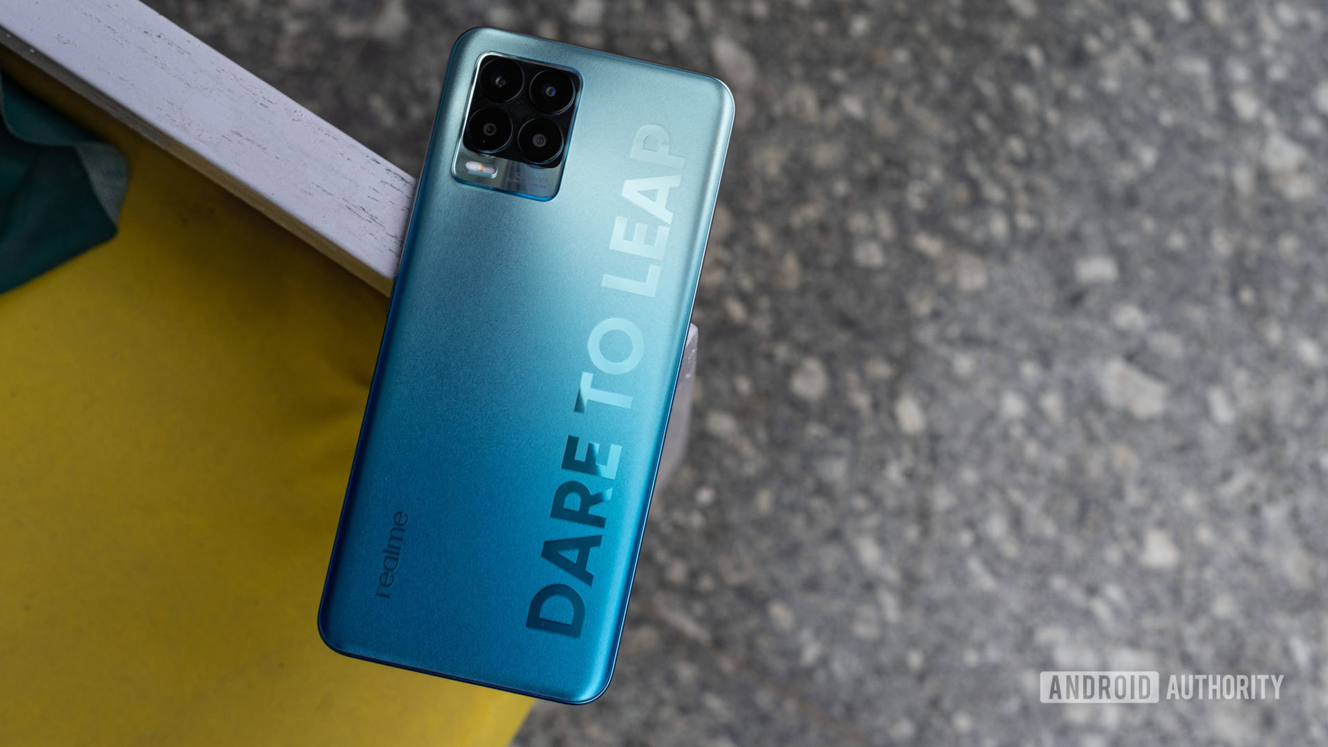
Like the Honor 50, the Realme 8 Pro doesn’t excel at subtlety. This time around, we have a large brand slogan emblazoned across the back of the device. Realme says that its designs have been well-received by fans of the brand. We don’t doubt it, but we certainly can’t share the appeal.
We asked you told us: Most of you hate huge branding on the back of phones
Unfortunately, if your heart is set on the Realme 8 Pro, there’s no way to ditch the branding. If you can look past it, though, the matte blue gradient does look rather nice — especially considering the budget price tag.
Motorola Edge (2021)

Eric Zeman / Android Authority
In 2020, Motorola debuted the Edge and Edge Plus — the company’s first flagship smartphone lineup in years. The Edge featured all of the design-related bells and whistles we’ve come to associate with flagship smartphones: a slim metal frame and excellent materials. Motorola even threw in a curved display and squared-off corners to amp up the premium look.
However, this year, the Motorola Edge shed those flagship looks for a much more generic avatar. The company swapped the metal frame for polycarbonate, downgraded the stereo speakers to a mono setup, and skimped on front glass protection with Gorilla Glass 3 instead of newer standards.
Read more: Our Motorola Edge (2021) review
The 2021 Motorola Edge doesn’t have a bad or jarring design by any means — but the phone is a notable step backward compared to its predecessor as well as most of the competition.
Apple iPhone 13
Dhruv Bhutani / Android Authority
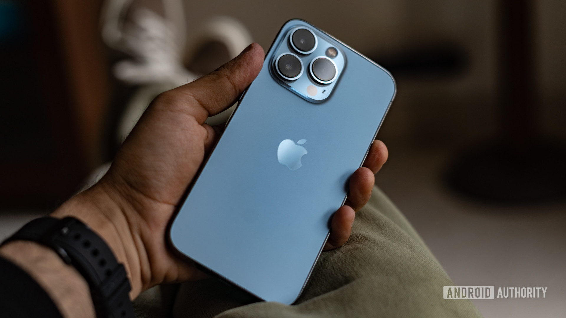
Just about everyone is familiar with the look and feel of a modern iPhone. Sure, the previous generation adopted a squared-off design, and this year’s iPhone 13 shrank the notch by 20%, but little else has changed otherwise. We’ve had the same basic iPhone design for years at this point, and it’s a little boring. Contrast that to the iPhone 4 era, when Apple clearly had the best smartphone design in the industry.
Android OEMs have marched ahead, meanwhile, introducing advancements like ultrasonic in-display fingerprint readers, edge-to-edge screens, and even hidden selfie cameras. All in all, we’re ready to finally see something radically different from the iPhone in 2022.
Which 2021 smartphone design did you like the least?
640 votes
What do you think of our choices? Did we miss your favorite smartphone design? Let us know in the comments below.
