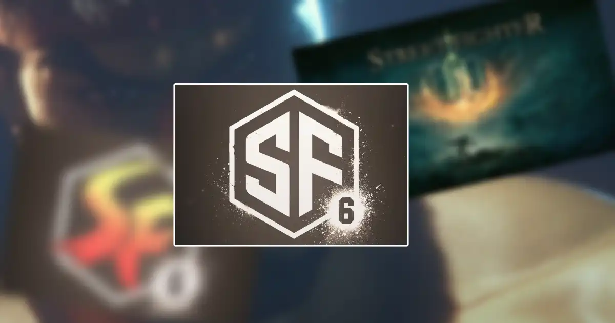
With the big Street Fighter 6 announcement that dropped after the Capcom Pro Tour 2021 finale this past weekend, fans have had a lot to talk about despite the teaser itself not being very long or jampacked with details. Viewers were treated to a look at Ryu and Street Fighter 5’s final DLC character, Luke, in the spiffy new, realistic looking graphics, but even still, the internet has turned their attention to the game’s logo.
Essentially, fans aren’t too impressed with how it looks, and an Adobe Stock logo design that looks nearly identical to what was shown sprouted a bit of controversy over the whole thing. Now, fans are taking stabs at creating their own Street Fighter 6 logos in hopes they can generate something that looks better than the acutal one.
There are a number of different approaches and styles for the SF6 logo here. Some of these look pretty darn good, actually, while others are clearly meant to be more on the humorous side.
The first we have here is from Twitter user perchedhere who took the existing logo and simply swapped out the big “SF” for the “Street Fighter” from SF5’s logo. While the “6” placement feels just slightly off here, overall it’s not a bad concept.
I reworked the SF6 logo while keeping the existing art direction (hexagon, splatter, “6” instead of “VI”).
It’s a derivative work–“Street Fighter” is ripped from the SFV logo & the splatter was based (traced but heavily modified) off a Google image.#StreetFighter6 #fanart pic.twitter.com/A492G2aZtR
— Jonathan Lee (@perchedhere) February 24, 2022
CH4N_GG went with the traditional Street Fighter logo color scheme and returned to the Roman numerals we’ve seen since Street Fighter 4. The result is a badass looking piece that pops even more with the dark, red, ominous image of Ryu behind it.
My personal take on the #StreetFighter6 logo! 🔥 #SF6 #StreetFighter #CAPCOM pic.twitter.com/rd9VK5nxLE
— ☘️| Chan (@CH4N_GG) February 24, 2022
The next handful of fan designs stick more with the graffiti aesthetic that Street Fighter 6 appears to be employing. Personally, I think MrBaconJam’s looks great, even if it does just use the Street Fighter letters from Super Smash Bros. Ultimate.
I made a new #SF6 logo Re-design, which one you prefer, lettering or minimal…/
Re-diseñe el logo de #StreetFighter6 cuál les gusta, tradicional o geométrico…#design #LogoDesigns #StreetFighter pic.twitter.com/r8dEOAQ1Oo— Digital Paladin (@Net_navi35) February 24, 2022
Felt that SF6 logo’s a bit ass, so did a no-effort redo by replacing the stock image-looking “SF” with the SF Series symbol from Smash, ironically enough. As well as a coloured variant just for the hell of it.
Still comes off like a Discord icon with 6 pings tbh. pic.twitter.com/q9tJ0v913h
— The Sundown Bacon (@MrBaconJam) February 22, 2022
I guess we’re doing this
—
SF6 concept logo
—
Feedback is appreciated! pic.twitter.com/bHRQOqM9h1— Schmerp (@schmerp_) February 24, 2022
Another Twitter user put together a very elaborate logo for Street Fighter 6 that I feel looks kinda familiar… Oh yeah, it’s a Street Fighter version of Elden Ring.
tried to redesign SF6’s logo, how did i do? pic.twitter.com/JhVnmmersA
— NueSB (@kybymyby) February 24, 2022
Lastly, if Street Fighter 6 were a Tony Hawk game, it’s logo might look like this. Honestly, I wouldn’t mind it so much if this were the game’s official one, but hey, maybe I’m just a sucker for nostalgia.
— tony hawk logos (@tonyhawklogos) February 22, 2022
It’s unclear whether or not the current Street Fighter 6 logo was just a placeholder or if that’s what we’ll be seeing come launch day. Either way, let us know which of these fan designs is your favorite in the comments below.


Receive and send emails through your temporary messaging system. Use our webmail or your favorite email software with our absolutely free disposable email. temp mail