Google released the initial beta of its browser in September 2008 and over 13.5 years later Chrome is getting updated to version 100 today.
The “Chrome” name reflects Google’s desire to have a minimal interface compared to other browsers of that era, as well as be fast, i.e. speedy cars. There’s still just one “Omnibox” for entering URLs and making web searches with navigation controls and other buttons to the left/right of the field, while tabs appear at the top.
After releasing major updates on six-week cycles for over a decade, Google in September of 2021 switched to milestone releases every four weeks to allow for faster security patches, bug fixes, and feature rollouts. Enterprise admins that manage large device fleets were given access to a new “Extended Stable” version that gets major updates on an eight-week cycle.
Most — but not all — Chrome features arrive via server-side updates instead of these monthly updates. For example, the new Reading List and bookmark Side Panel arrived that way towards the end of the version 99 cycle.
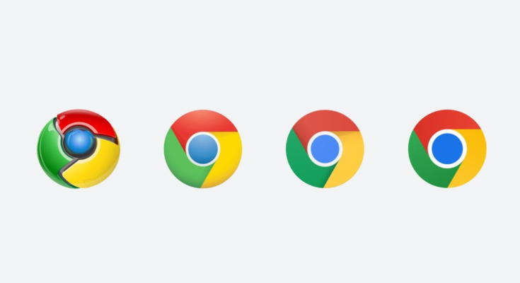
That said, Chrome 100 brings a brand new logo after installing the new version.
New Chrome 100 icon
As previewed earlier this year, Chrome has a new icon to better align with modern (circa 2015) Google. The browser has had three other designs since 2008 and its fourth flattens the logo entirely. Shadows have been removed, while the blue, red, yellow, and green get ever so slightly brighter. Lastly, the components have been tweaked with the inner circle getting larger and the outer ring now slightly thinner.
Another goal of this redesign is to optimize and make the icons native to each operating system.
- macOS: The three-dimensional (3D) nature is particularly evident at the bottom. You’re basically viewing a very short cylinder from an angle. Beta/Dev channels denoted by banner in the top-left corner.
- Windows: An “obviously gradated look” that looks home on Windows 10/11.
- Chrome OS: Brighter colors
- Mobile:
- Android: Straightforward icon that mercifully does not have a white border around it, (e.g. YouTube Music)
- iOS: Also straightforward, while Beta channel gets a “blueprint-like” design in the style of TestFlight.
Chrome 99 on Top and 100 on Bottom
Chrome 100 for Android
The Android app gets a handful of changes with Chrome 100. Material You is now available in more places following the initial redesign with version 94. Instead of light or gray backgrounds, Dynamic Color is now used in the overflow menu and Settings page.
On the New Tab Page, there’s a tweaked switcher to go between Discover and Following (RSS), while Lite mode has been removed.
99 on Left and 100 on Right
Update to Chrome 100
On macOS, Windows, and Linux, open Settings and go to “About Chrome” at the bottom of the side navigation drawer. Chrome will automatically start checking for the version 100 update and you’ll be prompted to restart your browser after it finishes downloading.
It’s rolling out on Android via the Play Store and already live in the iOS App Store. The Chrome OS update should start on Thursday.
Meanwhile, the Chrome Developers site has a cool 100 cool web moments timeline.
FTC: We use income earning auto affiliate links. More.


