The public Android 13 beta is here, and it’s our first chance to look at what might be coming in Google’s OS update. We’ve already learned a bit about what the company will be focusing on improving for the next version, and a lot of it sounds like backend changes that might not make a huge impact on daily use. Android 13 is supposed to bring finer privacy controls and more themed app icons. Though, there’s probably stuff in the works that the company has yet to share – don’t forget Google I/O coming up in two weeks.
Most of the updates in Android 13 beta 1 are barely noticeable, and many of them are developer-centric. Things like more-granular permissions for media file access, better error reporting and “anticipatory audio routing” aren’t things that will immediately make an impact on how you use your phone. These are tweaks that app makers will have to implement before you’ll see a difference, as are upcoming features like themed app icons. Still, there are a few new functions that might pique your interest.
Before I go any further, I have to warn you, as usual, that installing any beta software comes with the risk of losing data. You’ll be opting into a platform that might not be stable, meaning your apps might crash or no longer work. If you’re very certain you want to give this beta a shot and are fully aware of what you’re getting into, you can enroll a supported Pixel phone on Google’s website, and a notification will appear on the device. I signed up with a Pixel 4a and downloaded the 1.79GB update with no trouble.
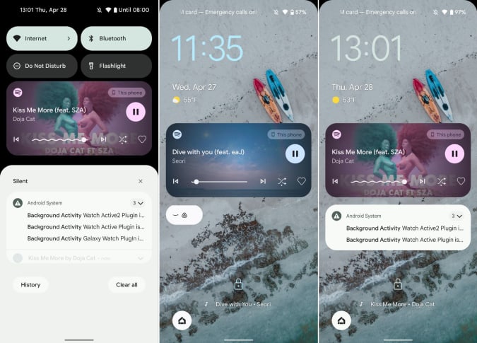
One of the first things I noticed after installing the beta was the refreshed media playback box. It’s taller in Android 13, compared to the one on my Pixel 6 Pro (running Android 12), and uses album art as the background. Instead of just showing pause, previous and next buttons in addition to the song title and artist, the new panel shows an animated progress bar that squiggles as the music goes on. On the card for Spotify, at least, I also got options for shuffling and liking the track.

Screenshots
This box’s new layout is great. Not only does it show more information and in a more attractive way, it also lets you drag the slider to fast forward through parts of podcast episodes without having to unlock your phone or launch an app. That said, I do miss the bigger buttons for skipping a track. Plus, it’s slightly buggy and said my music was playing on the Pixel 4a instead of my Nest Audio speakers where it actually was streaming.
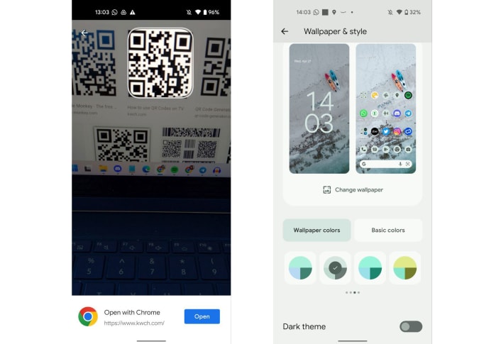
Android Police also spotted a new QR code scanner shortcut in the quick settings panel that launches a dedicated viewfinder. In my brief testing, this was not only super speedy, as Android Police pointed out, but it’s much easier to use. Instead of having to open your camera, aim it at a code and try to hit the tiny little Chrome bar that pops up, you can just point this new scanner in the direction of the symbol and it latches on instantly. A box pops up at the bottom with an “Open” button that’s larger and much easier to tap, and the viewfinder closes, instead showing a picture of the code you just snapped. That means you’ll no longer have to hold your phone steady to keep the code in view while using your other hand to tap the tiny, tiny link.

Screenshots
This is definitely a more convenient way to scan QR codes, which have become more prevalent during the pandemic, with many businesses using them to serve up contactless menus. But I will say that, on very rare occasions where you are aiming for one particular code out of a few, this version of the scanner is trickier to handle. Since it immediately snaps a photo of the first QR code it sees, you’ll have to wrangle it a bit to get the one you actually want.
Some other changes include new Material You themes and improvements to app suggestions in the large-screen friendly L version. You can now choose from about 12 more color palettes automatically generated from your wallpaper to apply throughout the system.
Though Android Police reports that the lock screen shortcut to access Android’s page of smart home device controls can now be accessed without unlocking your device, this wasn’t true for me. I was still asked to enter my pin when I tried to turn on my living room lights from my Pixel 4a. But this could be a bug and it might be working for other beta users.
All told, there were surprisingly more user-facing changes in Android 13 beta 1 than I had expected, and I’ll need some time to dig around for things we may have missed. But I still wouldn’t recommend anyone other than the most eager early adopter to install it — unless you scan dozens of QR codes a day. For now, it’s still too early to tell what Android 13 will look like, but it’s nice to see Google is working on some thoughtful new features at least.
All products recommended by Engadget are selected by our editorial team, independent of our parent company. Some of our stories include affiliate links. If you buy something through one of these links, we may earn an affiliate commission.


